


Website navigation: Your guide to user-friendly website operation
Navigation structure, user-friendliness & co.
When it comes to the design of websites and stores, website navigation is a decisive success factor. This is because users visit websites to obtain information or carry out a transaction and rarely stay on just one page. With good navigation, you can ensure that users can find their way around your website easily and get to the information they are looking for intuitively and quickly. As a website operator, your aim is to avoid a high bounce rate and to ultimately encourage Internet users to convert with a simple and logical navigation structure. Various navigation concepts are available for this purpose.
In this blog article, you can find out why navigation is so important, what role user-friendliness and the designation of navigation levels play and which types of website navigation are currently popular.

All information about website navigation
- The most important facts about website navigation in brief
- Definition & role of website navigation
- Types of website navigation
- Horizontal navigation concepts
- Vertical navigation bar
- Multi-level menu" navigation concept
- Examples from practice
- What makes a good website navigation
- Conclusion on structured main navigation & other navigation elements

Links: Different types of website navigation
Linking pages within a domain is not only useful for the search engine. They also make it easier for users to navigate between the individual pages. Whether as a main menu, text links, teasers, call-to-actions or in the footer - links can be designed in a visually varied way and can therefore be placed more conspicuously or less conspicuously on a website.
Global website navigation: the key element of every website
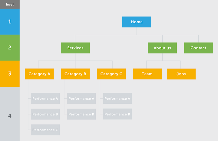
The term global refers to the website navigation, which is identical on every webpage of a website. By default, the most important global navigation element of any website is the main menu. The main menu acts as a table of contents that reflects the hierarchy of the website. It uses menu items at different navigation levels to show users where on the website which subpages or information can be found. There are various display options for the main navigation on websites and in online stores. We present these in more detail in the next section.
The linking of navigation points in the footer is also global. Other important pages can be linked in the footer menu. The footer can be kept minimalist with links to the legal notice and privacy policy or can be embellished with links to particularly important pages.
Local website navigation on subpages
Website navigation that takes place via the content of main category pages or subpages is referred to as local navigation. It differs from page to page and usually links to subpages or relevant subpages, landing pages or similar. In addition to text links and teasers, the breadcrumb is also a form of local navigation. This is usually located at the beginning of the page under the main menu and possibly the header image or at the end of the page and represents the path on which the user is currently located. The individual path points are usually also linked and can be clicked on.
Website navigation: Hierarchical main navigation
If the menu items in the main menu change depending on the thematic focus of the page currently being visited, this is referred to as hierarchical navigation. This type of navigation structure is used when the menu should change completely after clicking on a category.
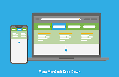
Mega Menu: The hierarchy of website navigation at a glance
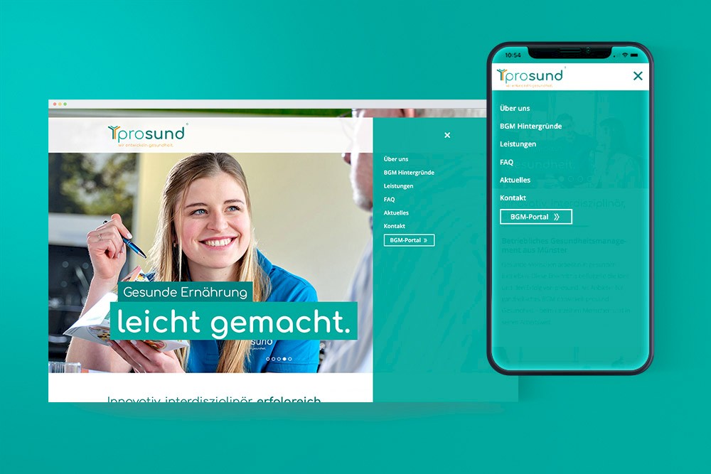
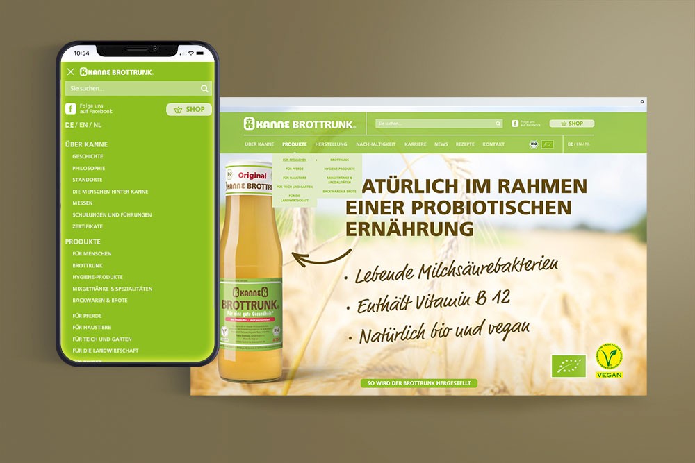
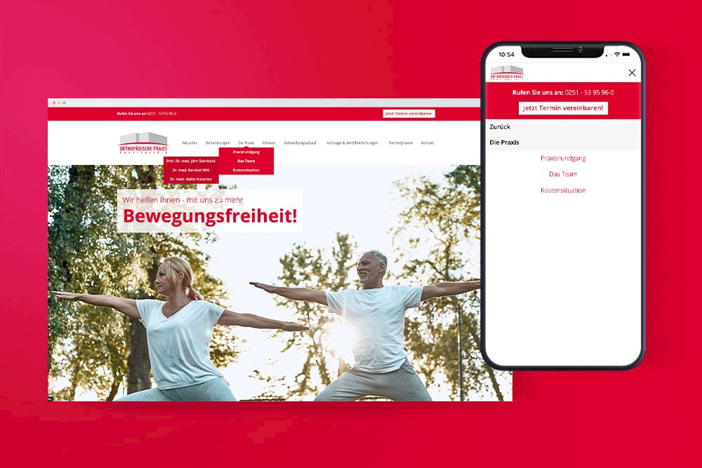
The classic horizontal main menu is the extensive mega menu. This type of menu allows you to display pages from different navigation levels at a glance, e.g. by hovering over a menu item in the main navigation. In most cases, the first level items are already listed in the menu bar. The complete menu can then be expanded via drop-down or fly-out. Occasionally, however, the complete menu can also be called up via the separate "Menu" item. If the menu opens from left to right, this is called a fly-out. This effect can be triggered either by clicking or hovering. If, on the other hand, the website navigation opens from top to bottom, this is called a drop-down menu. Here too, a website operator or the commissioned agency must consider whether the menu should be opened by clicking or hovering when creating the web design.
The mega menu allows Internet users to quickly get an overview of all the main categories and subpages on the website. Without many clicks, they can find their way to the desired category page, landing page or product page. However, depending on how many navigation levels your website has, it is advisable not to display all subpages in the main menu. Hiding them completely from the main navigation with corresponding links to the higher-level category pages or displaying them after clicking significantly streamlines the menu. This should be taken into consideration, especially against the background of mobile display.
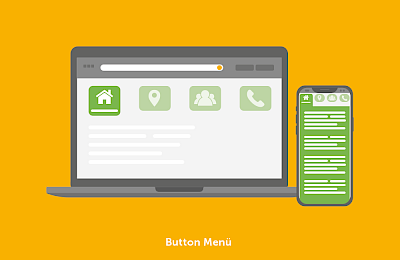
Button menu: visually appealing & clear navigation
A button menu is a horizontal navigation element that is very similar to the mega menu. The key difference: icons or images are used instead of text to describe the menu items on the first level. In this navigation concept, category pages and other subordinate subpages in the website navigation are usually displayed in text form. Occasionally, text is also combined with images in the menu button.
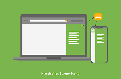
Burger menu: space-saving & hidden
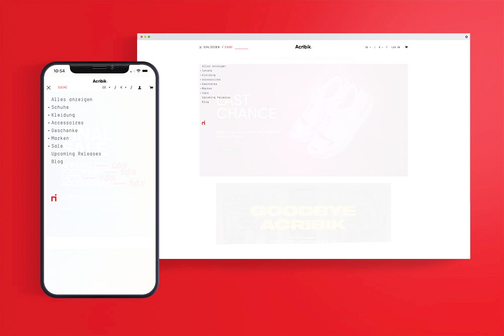
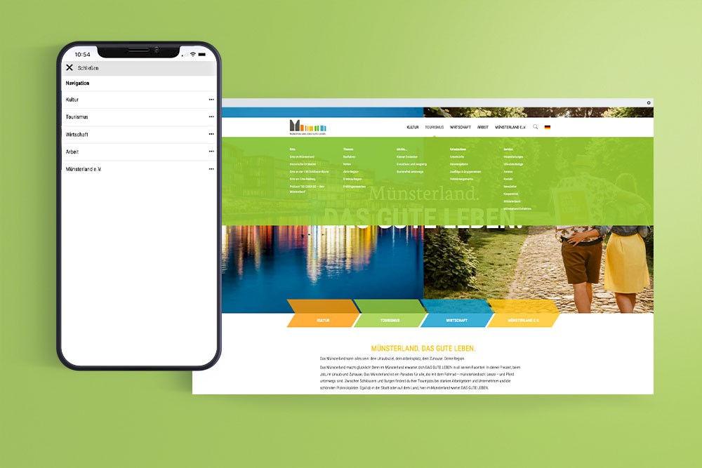
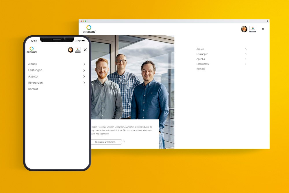
The burger menu is becoming increasingly popular as website navigation. With three bars or dashes below each other as a navigation element, this type of menu is minimalist and ideal for mobile devices. On click or mouseover, the menu opens either on the left or right. The main categories on the first level initially remain hidden on the start page. The first level becomes visible after clicking on the three dashes. Occasionally, the burger menu can also be found as full screen navigation. The menu can be further developed with colors and the use of icons. However, the burger menu is also increasingly finding its place in the desktop display. A clean introduction to the website is considered very modern. Many websites today have a very reduced web design with a full-screen image, the logo and the three lines of the menu.
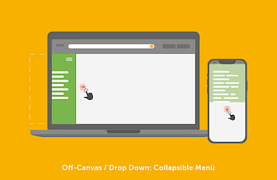
Off canvas/drop-down
Are you looking for a particularly space-saving menu? Then you should consider an off-canvas menu for your website navigation. This type of menu is particularly practical for responsive web design. When the screen width is small, the menu items are outside the field of view and can be called up by the user with a click. As the screen width increases, more of the menu becomes visible.
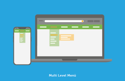
Navigation concept "Multi Level Menu"
This website navigation is a mixed form of vertical and horizontal arrangement of the menu items. The first-level menu items are usually arranged in a horizontal bar at the top of the page. After clicking or mouseover, a column opens vertically via drop-down, in which all subpages of the corresponding menu item are displayed. If you click on these again, the subpages of these categories open vertically.
While in theory there is a clear distinction between the different menu types, in practice you will usually find a mixture of the different navigation concepts
Website navigation: examples from practice
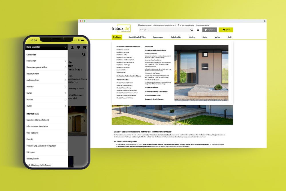
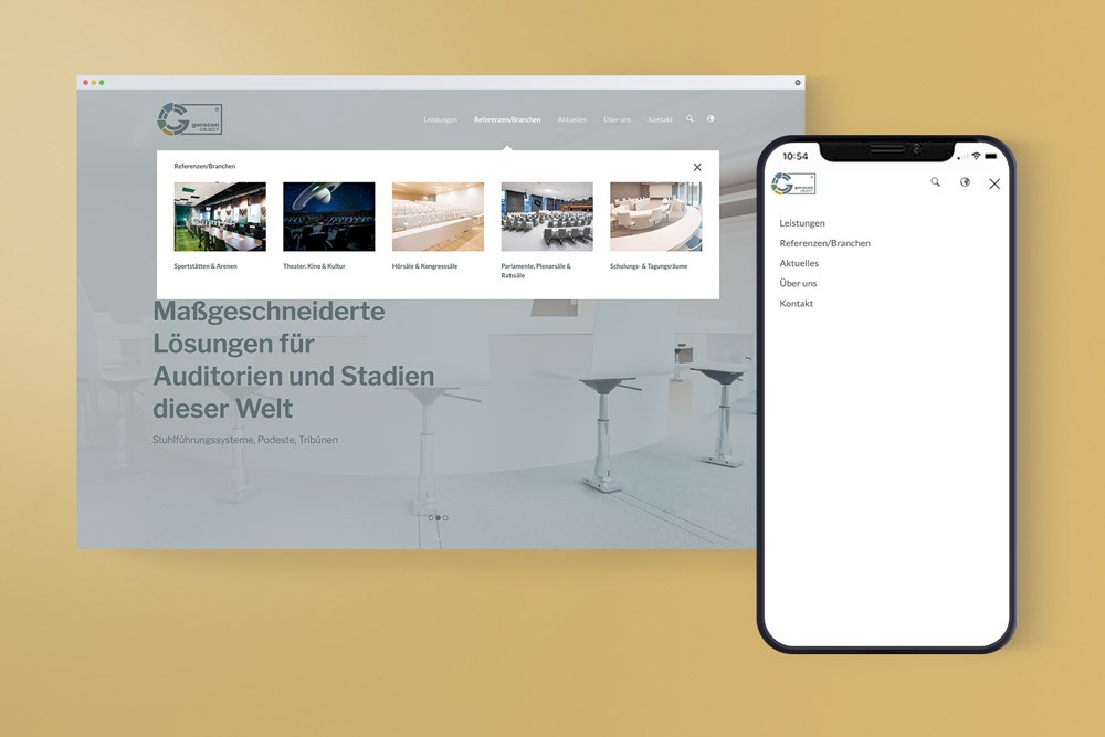
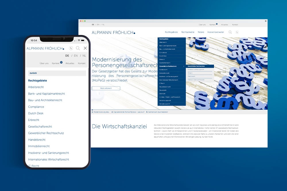
Structure of a website

Mobile compatibility: website navigation on mobile devices
Access to websites via mobile devices has been increasing steadily for years. Navigating via control panels that are too small with illegible text is no longer up to date. In line with the mobile-first principle, websites and online stores are now optimized for mobile devices right from the start so that website navigation also works smoothly on smaller viewports. A responsive web design is therefore a must in order to provide your customers who access your website via a cell phone or tablet with a pleasant user experience.
Highlight menu elements & navigation elements: visual aspects
The main menu of every page should be easy to find and stand out clearly from the rest of the design. The visual separation of the menu elements from each other and from the rest of the page can be achieved, for example, by using a special color scheme for the menu bars or by using a different font and color. However, the latter should only be considered if this font is also used elsewhere on the website, for example in the headlines. It is advisable to use the colors that appear in your corporate design. Make sure that the spacing between the individual menu items is neither too large nor too small in order to ensure optimum legibility of your website navigation.
Consider the short attention span: Miller's number
Studies have shown that humans can grasp an average of seven objects at the same time. Anything beyond this cannot be absorbed by short-term memory and is forgotten. Miller's number is also used in the creation of website navigation. It helps to avoid overwhelming customers with navigation and to navigate them through the pages without confusion. For example, the optimal website should not have more than seven menu items.

You need help with your website navigation?
As an SEO agency and professionals in web design, creating intuitive navigation structures for users and search engines is child's play. Contact us without obligation and make an appointment to get to know us! We look forward to supporting you in creating an understandable and well-functioning website navigation!


About the author Niko Hülsmeier
Niko Hülsmeier is a partner and managing director of the digital agency DREIKON. He has been developing websites, portals and individual software solutions for around 25 years - with a focus on fast, clean implementation, process optimisation and pragmatic solutions for companies.